
Looking at the USE dialog possibilities of new references
Well I could do this:
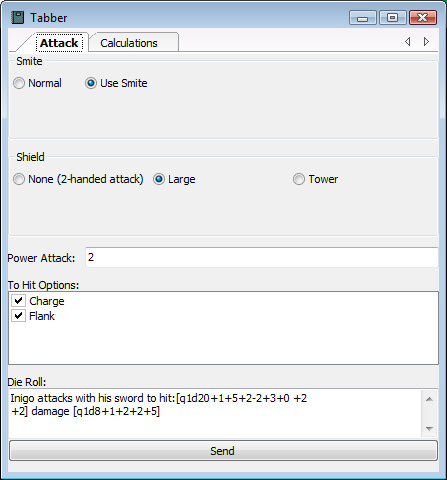
Pretty much works as it looks like it should including eg tower shield gives a -2 to hit and when attacking two-handed the strength and power attack bonuses are increased. Note that the Die Roll text box doesn't contain any crappy !@...@! stuff because for display purposes it just shows you the end result. It's also read-only. Unless you alter the default setting in which case you get the code and can edit it even in the "Use" dialog. Also the whole dialog remembers its size and position on the screen, even between sessions.
If you're interested the stats are for a 5th level paladin with 16 cha and 14 str, using a +1 longsword (in order) the to hit bonuses are +1 magic weapon, +5 bab, +2 str, -2 power attack, +3 smite, +0 shield to hit penalty, +2 charge, +2 flank. And the damage is +2 str, +2 power attack, +5 smite
It could probably be improved by checking that you don't specify a power attack greater than the bab and by deducting a point of smite usage whenever you roll a smite attack.
Several issues arising from briefly looking at the Use dialog approach:
(1) some of the nicer formulaic evaluations only take place when reproting the value of a node. For example the smite to hit bonus is calculated as, "!@Cha@! if !@Smite@! else 0" which is a simple usage of the "X if Y else Z" feature BUT it won't work in-line. If you add that text directly to the node called Die Roll then it won't evaluate. This is confusing and forces an extra layer of indirection (ie you need to create a node called SmiteToHit and put the formula in that). I think rounding to integer also only happens that way. probably min(,) and max(,) too.
(2) the calculation results displayed in Die Roll don't update on the Use dialog in real-time as you later the various input buttons.
(3) Need to be able to specify a node as invisible, especially text and grid nodes that are used to hold calculation nodes. As it is I stuffed them all in a tab that you never have to look at.
(4) There seem to be a lot of gaps between the various input panes. It might be nice if the size was taken from the (saved) size of the individual node's use dialog so you could set a nice spacing, or failing that make it smaller. Also an option to not have the title displayed eg if the check "no title" is on, would be nice.